CHECKOUT
Several friction points were recorded in the checkout experience.
We updated checkout from a single page with multiple forms and inputs into staged process with digestible bites.
The Brief
To improve the conversion rate for all audiences by streamlining the checkout process.
Reducing incorrect address input for international customers and understanding their requirements and problems when shopping abroad.
The Process
Multiple phases of discovery and usability testing on the existing and new versions of the checkout.
Analysing error events on all checkout form interactions.
Studying the address formats of our top international customer countries and localising forms to improve interactions and submissions.
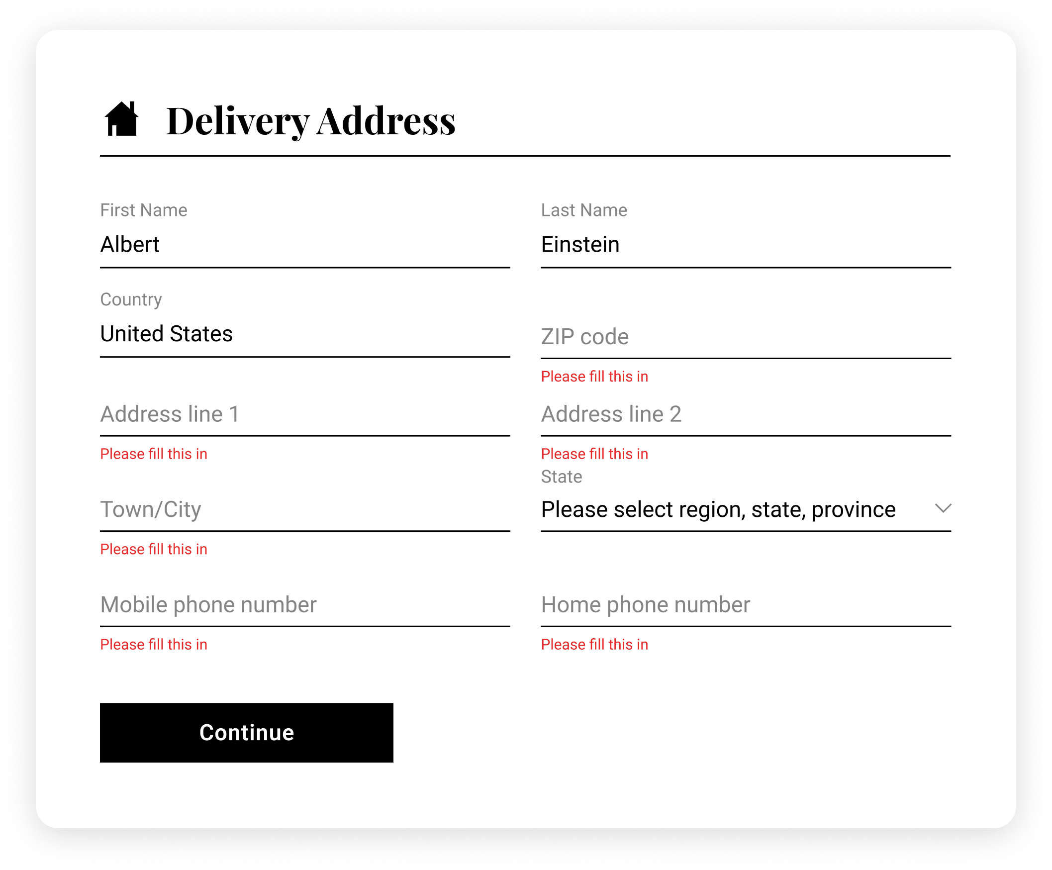
Before
The existing checkout was all on a single page.
Impressions on landing were that there were several fields to populate, the text was small and hard to read, and the process overall looked long and tedious.
Through extensive testing we found the following issues to fix alongside the main streamlining objective.
Users became annoyed at a frequent issue with delivery and billing address forms becoming confusing.
Mandatory fields weren’t clear and input wasn’t checked for validation, leading to a large number of incorrect content being input.
Elaborate on total order cost for different countries and account for international shipping, taxes and duties.
Localised Forms
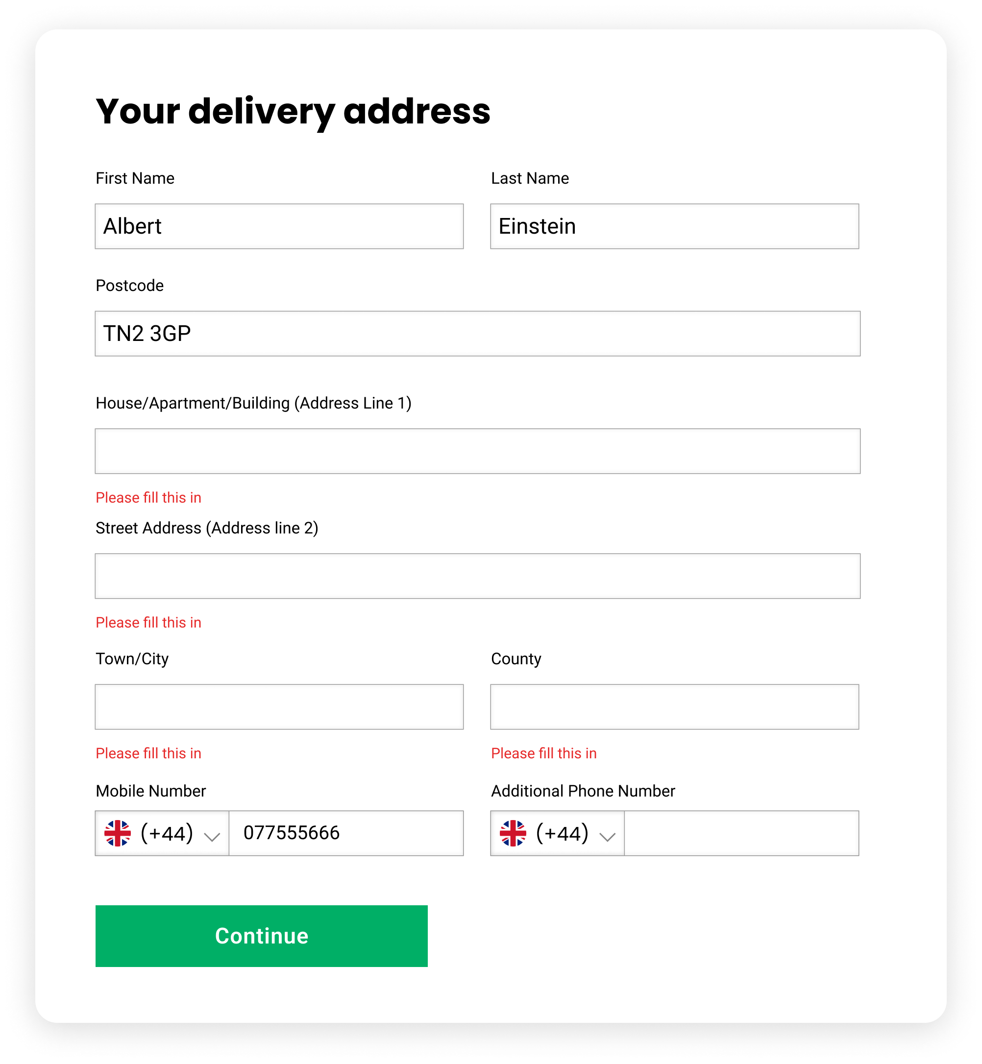
After selecting the delivery country, the checkout loads the localised address form. Flag icons are used to highlight the selected country to help avoid language issues.
Address forms were attached to the databases from courier providers. Users could automatically add their shipping details from the first line of their address and the form would auto-suggest the remaining details.
Phone number fields also change to meet the local format, but the country code can be changed to accommodate users delivering aboard.
Form Fields
The form fields were updated to boxed instead of underlying, which was clearer for users.
The address form was listed in a single column, making it easier for users to read and process.
Validation error messages were shown for missing fields and incorrect input, instead of only showing after submission.
Field labels were marked more clearly and changed for localised audiences.
Mandatory fields were marked to reduce validation error events and user friction.


