PRODUCT DETAIL PAGE
The Product Detail Page renovation required high focus on user’s needs as well as interactions.
The Brief
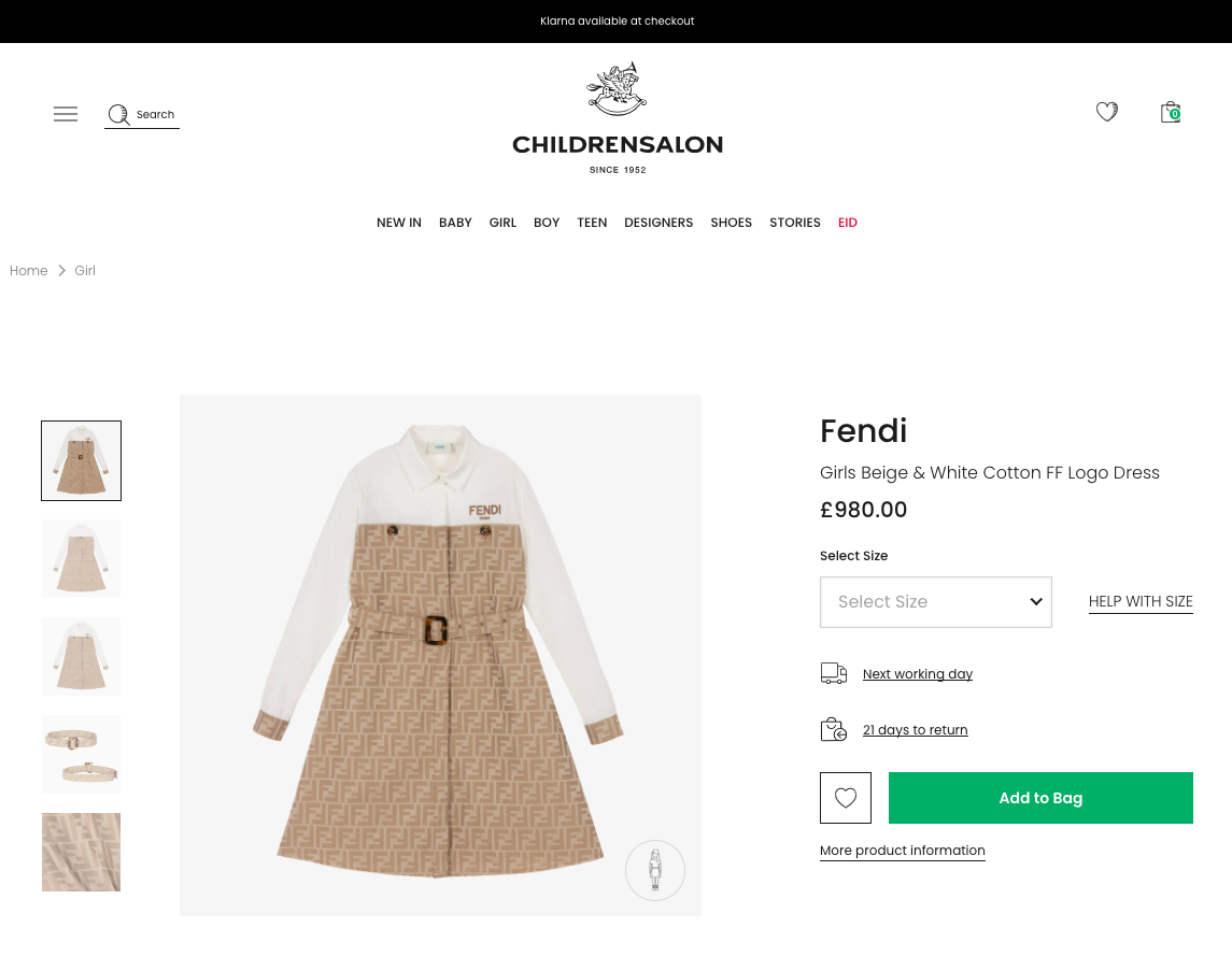
To investigate and evaluate how users are interacting with the current rendition of the PDP page.
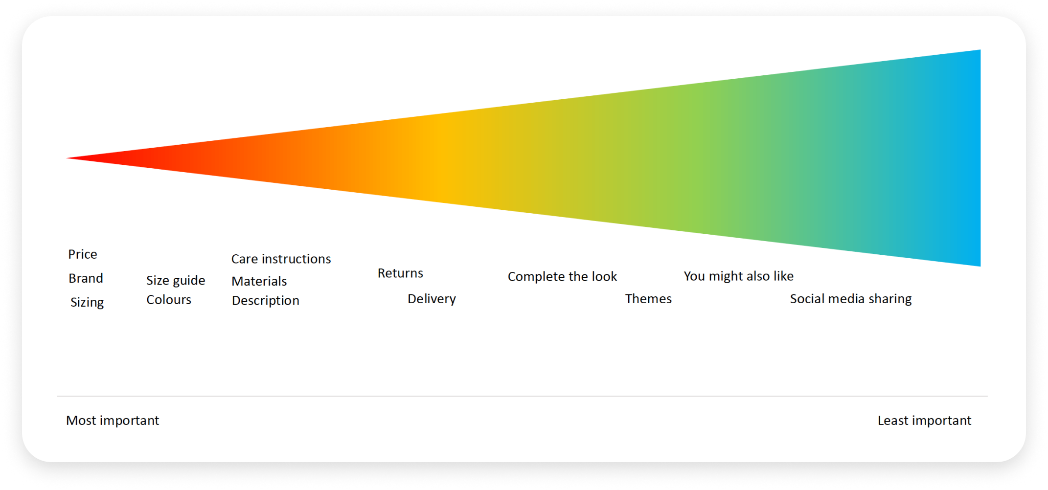
Focus on the hierarchy of information available to customers and find out what is most valuable to them.
Identify any potential problem areas.
The Process
Several online user tests were performed to find out from the users what of all the information available to them was considered most to least important.
Consistent patterns emerged specifically from gender and income sorting groups.
Heatmaps were used to look at desktop vs mobile scroll rate, and areas of highest attention.
WHAT WAS DELIVERED
A larger gallery and thumbnails for product inspection.
A dedicated area of the material type with close up images for inspection and means to navigating to other items of the same material within the selected category.
Secondary most important lot of information was sizing, delivery and returns, product description and bullet points for quick scanning (including care instructions).
Delivery and returns information was confined to a slide out drawer to save on screen estate but always be accessible.
Prioritized the product brand, name and price in the new information hierarchy.
The main UI controls for add to bag, wishlist and size selection were made into a sticky bar whenever the scrolled past the fold so they would always have control to add items to their bag


